 Standard Normal Distribution Plushie by NausicaaDistribution
Numbers for each month have been adjusted to take into account the fact that not all months contain the same number of days (otherwise the results can be misleading). This was done by calculating a daily average for each month then multiplying by 30 to give a general idea of actual monthly levels (not a perfect approach, but I thought it was appropriate for this blog post).
Disclaimer:
I have purposely avoided providing much interpretation of the figures presented here so that people can draw their own conclusions- stats can often be interpreted in a number of different ways. Also, keep in mind that it can be difficult to make predictions for individual cases (ie shops) based on these kind of averages, and to know whether small changes reflect normal variation or 'real' changes. I think the relative measures in the second section are most informative in terms of questions or concerns about sales and traffic (eg average number of sales per shop).
I collected the information by going through each weather report and (after quite a bit of hunting) found a record of the data released by etsy concerning the number of sellers for 2009-2010 on this blog run by DuhBe. If you're making any important decisions based on the data it would be best to check the numbers for yourself.
Basic Measures
Average Number of Items Sold 2008-2010

Average $ Amount Sold 2008-2010

Average $Price of Item Sold 2008-2010
 The increase here could be due to an increase in item prices in general (or possibly a trend towards purchasing more expensive items)
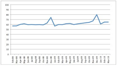
Pageviews 2008-2010
 (Etsy didn't provide the figures for the missing months)
Number of Active Etsy Shops 2009-2010
 Defined as shops with at least one active item, displayed by etsy here: www.etsy.com/shops_sellers.php
The figures in the graph are based on these numbers as recorded by DuhBee
New Listings Added 2008-2010
 Etsy reports 'newly listed items' in their weather reports. I don't know whether this includes relisting etc (probably doesn't include all listing activity), so this graph is just intended to give an indication of the pattern of listing activity over time.
Relative Measures
Average Items Sold per Shop 2009-2010

Average $ Amount Sold per Shop 2009-2010

Average Views per Shop 2009-2010

Average Number of Sold Items vs Newly Listed (%) 2008-2010
 This graph gives an indication of whether the relationship between sales and newly listed items is changing (if competition for sales were increasing due to lots of new sellers joining the site without a corresponding increase in buyers, the percentage would be expected to go down across time). As noted earlier, this is based on newly listed items, but presumably there would be a strong correlation between newly listed and relists/renewals.
Average Views Relative to Each New Listing Added 2008-2010
 As for the previous graph, this is based on new listings. The absolute numbers therefore may not be very informative because a proportion of those pageviews would be views to other pages/existing listings etc, but it may give an idea of the general pattern of the relationship between listings and traffic (including the competition aspect mentioned above).
 53 Percent of Statistics are Made Up Cuff Links by Bellamodaartist


interesting to see it in graph form, puts things in perspective.
ReplyDeleteThank you- interesting to see these numbers in an easy to understand graph :)
ReplyDeleteI really love charts and graphs...thanks so much for doing this. Now I can see!
ReplyDeleteVery interesting, thanks!
ReplyDeleteVery interesting and helpful. Thank you!
ReplyDeleteLove the graphs-- Thanks for all of the efforts you have put into this!
ReplyDeleteThank you so very much for sharing!
ReplyDeleteThank you for the time you have put into the information!
ReplyDeleteI like the graphs. It's good to see how the information balance out per show. I'd love to see the median - I loved stats. Numbers and graphs turn me on
ReplyDeleteThis is really interesting, and actually makes me feel better. I guess I look at the successful shops and feel bad, but in fact my stats are a bit above average.
ReplyDeleteWow, thanks for all of the work here on this post. I think that my shop fits in perfectly with the decline in views and sales in March, it's amazing to see a site-wide graph that shows it too.
ReplyDeleteIt's amazing to see the drop in Pageviews, and yet the number of new sellers is stable. So, that helps me toss out the "over-saturated" theory a bit. Which, I never put much stock in to be honest. Plus, the decline in new listings and still, sales have slowed for many of us still listing.
So. I'm not crazy. Staticical analysis proves it. Phew!
Thanks for the post again!
Thanks for the info
ReplyDeleteThank you for the graphs. Though they just make me more angry with admin. grrrrr.
ReplyDeleteGreat work. I love the statistics cufflinks. :0
Love the cufflinks. The most informative graph of all for me is the one on Sold Items vs Newly Listed. Made me realise that as much as I hate to, I need to relist relist relist! Thanks, Morph!
ReplyDeleteThank you for these graphs. I am going to bookmark your excellent blog.
ReplyDeleteI like graphs! I easily grasp the visual over the need to swallow words and numbers. Thanks.
ReplyDeleteYour sleek ,fun jewels are right on the mark! They are beautiful and elegant!-Rachelle Starr
aka VintageStarrBeads and StarrBeads on ETSY
thanks for putting this together!
ReplyDeleteThanks for the graphs - very interesting.
ReplyDeleteI used etsy weather reports + compete data for etsy to create an infographic on etsy: http://bit.ly/etsy-infographic
ReplyDeleteIt's still a work in progress as still need to do some finishing touches (readibility of references), but would love to get feedback on my blog if you find this useful