 In the Pink Fine Art Flower Photography Print
There is no doubt that the greatest challenge for anyone selling products on Etsy is photographing those products. There are endless threads bemoaning the frustration of trying to get "Front Page worthy" photos. For us photographers, it's a breeze, but it's also easy to forget just how challenging it can be for someone who doesn't sleep with a camera in their hand...
Over the past little while, I've written several forum threads on Etsy regarding product photography, and I thought it would be a good idea to transcribe them here, as well as linking to them.
(You can find links to the original Etsy threads at the end of this article, so that you can read through all the comments, questions, and discussions)
A Quick and Dirty Science Class
Digital cameras: For those days when you just want throw it at the wall as hard as you can.
Just like film cameras, digital cameras collect light. The shutter opens, and light comes in. Your camera’s sensor looks like a Shreddie (Chex?), with lots of little square wells. The light pours in and starts to fill up those wells.
But the sensor is an electronic device, and as such, it produces “noise” like all electronic devices. It’s not noise you can hear, like the humming of your old stereo when the music stops. It’s image noise, which makes photos look grainy and fuzzy. And you know how if you turn up the volume on that old stereo, the humming gets louder? Well, same thing on your camera when you set it to a higher ISO. There’s actually a little amplifier inside that cranks up the sensitivity of your camera so you can take pictures with less light. Problem is, it cranks up the noise even more.
So: High ISO=BAD
There’s another thing that can happen that has the same effect, even on low ISO. If your camera sees there’s not much light, it just leaves the shutter open longer to collect enough to give you a decently bright picture. So the light’s coming in, making an image, but guess what? That @#%^&% noise is building up too. And it accumulates. And the picture ends up looking as bad as on high ISO.
So: Low Shutter Speed (long exposure)=BAD
This is just about when you start looking at that wall, and wondering how hard you can throw this piece of junk. And your head starts to spin…
I should buy a better camera
I can’t afford a better camera right now
My pictures suck
*bite nails*
What am I gonna do?
The solution is so simple; it’s almost a joke. More light. Yup, you’ve heard it before, but your house is dark, the sky is always cloudy, the kids are screaming…
All you have to do is grab a couple of lamps and put them close to the stuff you’re shooting. If your Lowes sells OTT bulbs, even better. The more light the merrier.
Fact is, you probably don’t need a new camera. In fact I’m willing to bet that just about every camera any of you own can take amazing photos, even if it’s a $30 Walmart special. Even the crappiest digital camera can take really good photos. It’s just a matter of giving it some light. Lots of light.
More Dirty Science
RTFM comes up a lot with reference to cameras, but unfortunately most manuals are written by geeks, for geeks. They’re so bad in fact, that even a pseudo-geek like me has a hard time with them.
For someone with ZERO knowledge of cameras (like 99% of the population), they may as well be in Latin. Or Canadian.
So in this class, I want to dumb down the entire camera manual, any camera manual, into two really simple concepts:
Shutter speed and Aperture.
I see Soap Girl’s eyes glazing over already in the back row. *Throws chalk at Soap Girl*
In spite of how complex they are, how much they cost, how big the manuals are, or who they’re made by, when a picture is snapped, only two simple things really happen. (OK, way more than two, but the rest we don’t care about now)
1. An opening in the lens (the Aperture) opens up a little bit or a lot to let in light
2. The shutter opens and then closes again, really quickly.
That’s it. That’s been it for 100 years.
The aperture opens up wide to let in lots of light, or it opens up just a tiny bit to let in just a bit of light.
Similarly, the shutter opens and closes slowly to let in a lot of light, or it does so really, really fast to just let in a bit. In film cameras, the shutter is like a little curtain that gets flung open to let light hit the film, and then closed very quickly. Digitals work a bit differently, but that doesn’t matter. The function is 100% identical.
So, the aperture is pretty basic. Lots of light (big) or a little bit of light (small).
The shutter does stuff we can relate to though. It’s exactly like opening your eyes. If you open them for 1 second, you see stuff happening around you. But if you just blink really fast, all you see is an instant frozen in time.
Shutter fast – just a blink of light, and frozen moment
Shutter slooooowwwww – light coming in for a long time, and lots of stuff moving around.
Your camera likes to have a balance of aperture and shutter speed because they both let in light. One determines how much, and one how long. So it balances them for you. If it uses a big aperture to let in tons of light, it will use a fast shutter speed. Conversely, if it uses a tiny aperture, it will keep the shutter open longer to compensate.
So here’s a little experiment you can just pretend to do.
You go to watch little Jimmy at his soccer practice. Luckily for you, little Jimmy really needs the practice because he’s a rubbish soccer player, which means he’s constantly running past you to get the ball. What a great opportunity. You set up your camera on the tripod and you take pictures of Jimmy as he runs past.
Let’s pretend your camera isn’t completely automatic. You set the aperture really small (very little light), and so you set the shutter to a long setting, maybe 1 second.
Here comes Johnny! Or is it Jimmy? Can never remember that kid’s name.
Click. There’s a picture of Jimmy, just looking like a transparent swoosh as he ran by. 1 second’s a long time.
So now you make the shutter faster, maybe ¼ of a second. Well, to get the same exposure as before, you need to open the aperture a bit to let in more light, since your shutter is now so much faster.
Click. Hey, Jimmy’s looking more like a little soccer player now. He’s blurred, but you can tell it’s him.
You’re already getting the hang of this. You set the shutter for 1/60 of a second, pretty fast. Of course you open up the aperture even more, and…
Click. Wow, he’s almost frozen in his tracks, with just some slight blur on his legs.
So now you set the shutter speed to 1/1000 of a second, super fast. That’s so fast in fact, you’ll have to open the aperture all the way.
Click. He’s perfectly frozen, leaping above the ground.
So all the while you had to keep trading of one against the other to get the same exposure every time. But if you wanted to change the exposure to make it brighter or darker, you now know there are a couple of things you could have done each time.
Want it lighter? Open the aperture a bit more than you did. Or, make the shutter a little bit slower to allow more light in. And the opposite if you wanted the pictures darker.
The good news is that for objects that don’t move, the shutter speed isn’t very important, so it’s one less thing to worry about.
Your camera always sets the aperture and shutter speed to get what it thinks is a perfect exposure. It has no idea what you’re taking pictures of or how you want them to look. But many very basic cameras do allow you to make little adjustments to the aperture and shutter speed, and thereby let you take in a bit more light, or a bit less.
Make Your Pictures POP!
Make your pictures "POP"; and doing it right is much easier than you think.
A common problem for many photos is their lack of dynamic range. Dy-what? That's the range of tones, from lightest to darkest in a photo, and extending the dynamic range is the single biggest difference between photos that look kind of flat, and those that jump right off the page. It's probably the biggest difference between a potential sale and no view at all.
This is especially true in thumbnails, and thumbnails are the one and only chance you have to make someone click on your item. It's the first thing they see while browsing your shop or browsing a general section, and this is where you want to grab people's attention.
To use a simple analogy, think of a stereo. If the sound is sort of flat, what do you do? Do you turn up the volume? Nope, you play with the bass and treble to make the lows lower and the highs higher.
It's the same with photos. Playing with the brightness and contrast is what most people to do add punch to their photos, but you know what? It's a little bit like just turning up the volume. The Brightness control just makes the whole picture brighter, including the dark stuff. That sucks. And contrast actually just adds distortion in most cases. That sucks too.
What you really want to do is stretch the dynamic range. In geek terms, this means adjusting the white and black points, but who the hell knows what that means? Well, you don't really have to. All you need to know is HOW to do it. And it's dead simple.
Picasa:
Double click on the file to edit it.
Click the tab that says "Tuning"
Look for the lightest spot in the photo, the bit that's closest to white.
Now slide the "Highlights" slider until that area is nice and white. If some other spot starts getting too bright, then just concentrate on that spot instead.
Now look for the darkest part of the photo, and slide the "Shadows" slider until it's as dark as you'd like it to be.
See the difference? That's "POP".
Picnik:
Click the "Exposure" button.
Click the "Advanced" button. (don't be scared!)
See the little box that pops up on the right side with the scary graph?
Drag the "Highlights" slider until the blobs on the right side of the graph get close to the right edge of the graph.
Now drag the "Shadows" slider until the blobs on the left get close to the left side.
That's "POP".
Photoshop:
Click on Image>Adjustments>Levels…
Uh-oh! Scary graph alert! No sweat…
Right below the scary graph, drag the little black triangle to the right until it's just below the part of the graph where the blobby curve starts going up towards the right.
Now drag the white triangle towards the left until it's near the part of the curve that starts rising up towards the left.
Click the "Preview" box off and on to see the difference. Some difference, huh?
Stop Being Invisible
Pictures.
Need I say more?
Well, yes. Much more.
Before anyone gets as far as your pictures, they have to first want to click on the thumbnail, because that's the first thing they see. There was a thread on this yesterday, and I wanted to do a show-and-tell.
The web is visual. Shopping on the web is extremely visual. Every day we read threads about low views or no views. It's not because the items are not good or attractive, but rather because nobody clicks them.
Your item's thumbnail is your one and only opportunity to get people into your shop. There's no grey area here. They click or they don't. Full stop.
That thumbnail has to make them want to click. It has to catch their eye, intrigue them, seduce them, make them open the door and walk into your shop. If you had a real store, it would be the display window. I say tag shmag. People mostly browse. Yes, they search too, but they mostly browse sections they're interested in. A page appears. 21 thumbnails, 75x75 in list view or 155x125 in gallery view.
If you're like me, you flick your Magic Mouse or you spin your scroll wheel, and zip down the page, your eyes darting around looking for something to jump out.
So here's an example. A beaded necklace, and two thumbnails out of many possibilities. Both shot with the same really crappy camera, in the same light at the same time.
One view from above, the whole necklace, the photo straight out of the crappy camera.
One close up, just a small section, levels adjusted after the fact.
List view:
Gallery view:
Which would you click? Even though you can't really tell what the 2nd thumbnail is, it stands out.
Here are the two full size pictures:
Notice how the dark photo, though not great, isn't too too bad in full size. It's dark, but that's the only issue. But in a thumbnail, it's just totally unclickable.
So while it's important to have great photos, spend lots of time looking at the thumbnails because they look totally different than the full size pictures. Use high contrast views. Make the colours POP. Make them visually interesting. You have 5 slots for pictures, so the main one doesn't have to show the whole item. Don't just upload you images to Etsy and then see them. Change your images to 75x75 or 155x125 and view them in real size on your screen.
How do they look? Do they jump off the page, or do they just sit there, waiting to be passed by?
Here are the links to the original threads on Etsy:
Stop Being Invisible
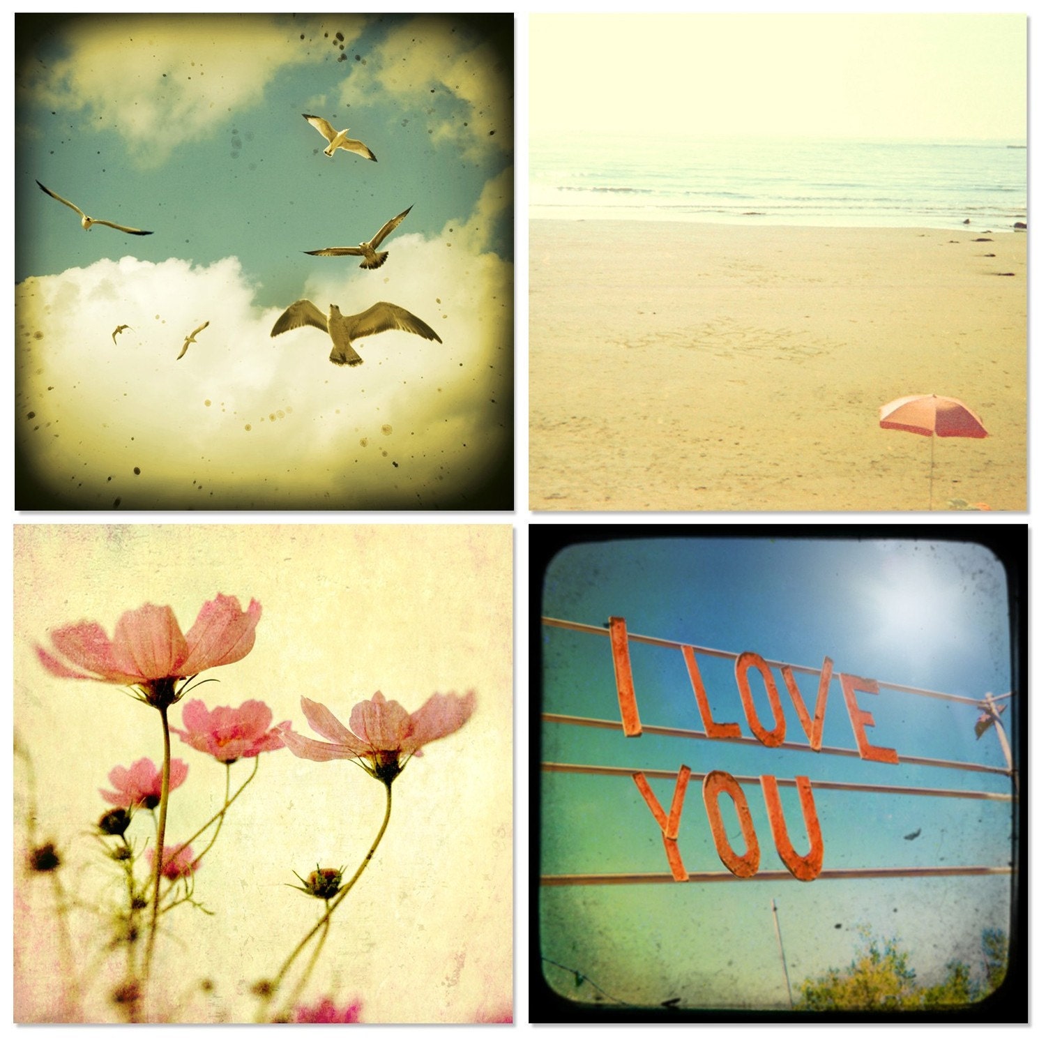 Apartment Therapy Set (featured on Apartment Therapy)
Written by guest blogger Bomobob.etsy.com
 Apartment Therapy Set (featured on Apartment Therapy)
Written by guest blogger Bomobob.etsy.com





Thank you once again, every little bit of information or explaination helps me move my products forward. Love your tutorial in simple analogies, makes it so much easier to understand. for my simple brain that carries too much complex stuff already.
ReplyDeleteGreat savory tid-bits to work on today and fun to read too!
ReplyDelete