Showing posts with label photos. Show all posts

Wednesday, December 1, 2010

Top 5 Etsy Mistakes

I've done a lot of critiques for many different kinds of etsy stores, and I've noticed that the main issues that come up are often the same. I've put together a list here that people can use to take a critical look at their shops - a lot of these things aren't very difficult to fix, but can make a huge difference to your sales

Polaroid Camera Brooch by craftyfolk

1) Average Photos
This is a big one. You have to have great products, but presenting them in an appealing way is absolutely critical. A good tip is to have a look at items that have made the front page using craftcult's vault feature and think about how your pictures compare. Also, a very common mistake I see in a lot of shops is that pictures don't look great/are chopped off in gallery mode. That is the version that they appear in for treasuries and features by etsy, so you are hurting your chances for free exposure if your pics don't look good. Another common issue is when earrings etc are not arranged carefully. Think about the angles you're using and take lots of pictures so that you can pick the very best ones- experiment with different positions with your camera.

A final common problem is with backgrounds. Generally, the item should be the focus rather than the background being used to create interest. Some sellers can successfully use interesting backgrounds, but it needs to be done very carefully. When choosing backgrounds, it's also important to think about how they will fit in with other items if being considered for a treasury or front page feature. If you're having trouble getting good shots, you can make or purchase a light box. You don't need a fancy camera- mine was only about $200 (you can see the one I use on the right side of this blog). Bomobob shared some great picture tips on this blog if you're looking for further tips.

2) Lack of Keywords and Short Descriptions
A lot of sellers who are struggling to make sales don't include much information in their titles or descriptions. Buyers need to know what the item is, all the essential information (eg measurements in mm and inches), and it's also great if they can get a feel for the creative process and the artist or designer behind the piece- that's part of the appeal of buying handmade! It's also important to think about how buyers will find you both on etsy and through search engines. Try to use keywords they might be searching for, and repeat the most important ones in your shop title, item titles, tags and descriptions where relevant. Each new keyword you use gives you another chance to be found, and repeating your main chosen keywords can help boost your ranking in google searches.


Shopping Cart Photo by jennifersquires

3) Shop Image Issues
As well as having fantastic photos, it's important to also have a clear non-fuzzy banner that fits with the overall image/branding of your shop. It's often the first impression a buyer will have of your shop, so it's worth spending some time on. Don't forget to also fill out your profile- that gives you a chance to provide buyers with some insight into the person behind the shop, and also allows you to share the story behind your creations.

4) No Policies or Feedback
Often sellers who approach me for help haven't filled out their policies and don't have any feedback. It's important to have shop policies in place to help you run your store effectively, but also to make buyers feel confident in you as a professional seller. I often also see statements like 'lost packages are not my responsibility', which will prevent some people from purchasing. Also, it's often not true legally, and PayPal will refund buyers if they do not receive their package, so it's best not to include statements like that. Regarding feedback, buying a few things to get some feedback can also encourage buyers to purchase from a new shop.


Custom Logo Cupcakes by shortbreadnyc

5) Small Number of Listings and Lack of Promotion
These are two major factors that can influence the number of sales you make. Having at least two pages of listings can make a huge difference- partly because it gives you more chance of being found in searches, but also because it gives buyers a selection and makes your shop look full and attended to. Once your shop is looking great and is filled up with cool stuff, the next thing to do is focus on promotion.

Some shops are lucky or have very searchable items, so don't need to promote a great deal. However, the majority of sellers are pretty much invisible without promoting off etsy. Certainly that's the case for my shop- I'd have about 3 sales without twitter and facebook I think- seriously! An important thing to keep in mind is your target audience, otherwise you might feel like you're 'promoting' all day and getting nowhere...other etsy sellers are often not a good target audience and you might spend all day every day trying to get sales from chatting in the forums when you could spend an hour promoting to non-etsy people and make more sales. You can find the article I wrote about how to do this with twitter here. Apart from not-so-great photos, lack of promotion is usually the biggest thing holding people back from making lots of sales.


Make more sales- subscribe to The Etsy Business Tips Newsletter


Twitter Power- How to Dominate Your Market One Tweet at a Time
from amazon.com

Thursday, November 11, 2010

The Brilliant Marketing Tricks Blog Series

Don't miss out on this! Some of the big creative entrepreneurs on the interwebs are getting together to present a Brilliant Marketing Tricks Blog series this week and next.

Here's a list of all the events, provided by Tim Adam:

Monday Nov 8: Introduction to the Blog Series – Mayi Carles from heartmade
http://www.heartmadeblog.com/blog/introducing-the-brilliant-marketing-tricks-blog-series

Tuesday Nov 9: E-books – Tim Adam from Handmadeology
http://www.handmadeology.com/e-bookology-the-formula-for-a-killer-e-book/

Wednesday Nov 10: Collaboratives – April Bowles from Blacksburgbelle
http://www.blacksburgbelle.com/2010/11/why-relationships-matter-more-than-any-other-marketing-tactic/

Thursday Nov 11 (double dose): Podcast + Interviews – Srinivas Rao from The Skool of Life / Stylish Marketing
http://theskooloflife.com/wordpress/
+ PR Services for Small Independent Businesses – Jena Coray from Miss Modish
http://www.missmodish.com/

Friday Nov 12: Services + E-courses – Tara Gentile from Scoutie Girl
http://www.scoutiegirl.com/

Monday Nov 15: Online Shops – Mayi Carles from heartmade
http://www.heartmadeblog.com/

Tuesday Nov 16: Events + Shopping Parties – Mallory from Miss Malaprop
http://www.missmalaprop.com/

Wednesday Nov 17: Video – Nathalie Lussier from Raw Food Witch
http://rawfoodswitch.com/

Thursday Nov 18 (double dose): Facebook + Twitter – Irene Zuccarello from Imaginative Bloom http://www.imaginativebloom.com/

Social Photo Catalogs like Flickr + Pinterest – Nancy from Wolf and Willow
http://www.wolfandwillowblog.com/

Friday Nov 19: Building your Brand – Brittni Wood from Paper N’ Stitch
http://papernstitchblog.com/


Rivet Series Camera 2 by TimothyAdamDesigns


Make more sales- subscribe to The Etsy Business Tips Newsletter

Sunday, July 18, 2010

Guest post by the famous Bomobob: Etsy Photography Made (as) Simple (as possible)

Kindly written and shared by guest blogger Bomobob.etsy.com (you've probably seen him in the etsy forums!) and originally published on bomobob.blogspot.com

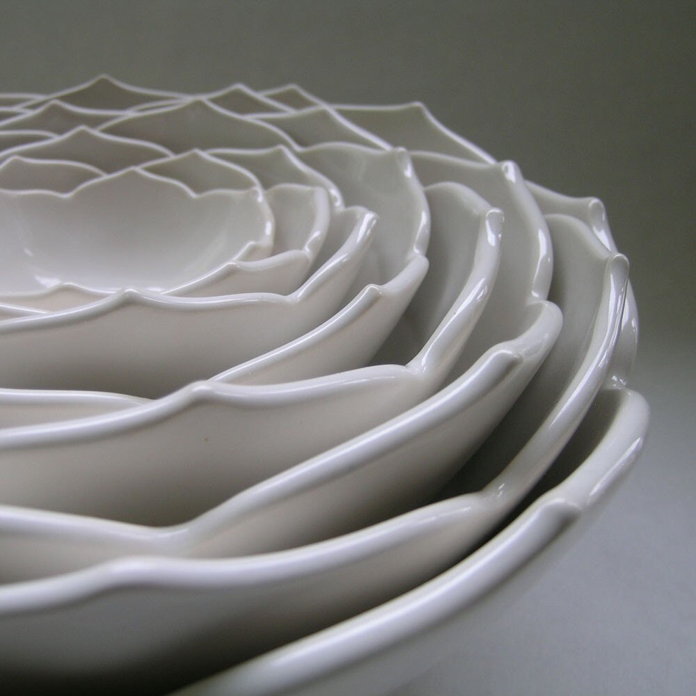
In the Pink Fine Art Flower Photography Print

There is no doubt that the greatest challenge for anyone selling products on Etsy is photographing those products. There are endless threads bemoaning the frustration of trying to get "Front Page worthy" photos. For us photographers, it's a breeze, but it's also easy to forget just how challenging it can be for someone who doesn't sleep with a camera in their hand...

Over the past little while, I've written several forum threads on Etsy regarding product photography, and I thought it would be a good idea to transcribe them here, as well as linking to them.

(You can find links to the original Etsy threads at the end of this article, so that you can read through all the comments, questions, and discussions)


A Quick and Dirty Science Class

Digital cameras: For those days when you just want throw it at the wall as hard as you can.

Just like film cameras, digital cameras collect light. The shutter opens, and light comes in. Your camera’s sensor looks like a Shreddie (Chex?), with lots of little square wells. The light pours in and starts to fill up those wells.

But the sensor is an electronic device, and as such, it produces “noise” like all electronic devices. It’s not noise you can hear, like the humming of your old stereo when the music stops. It’s image noise, which makes photos look grainy and fuzzy. And you know how if you turn up the volume on that old stereo, the humming gets louder? Well, same thing on your camera when you set it to a higher ISO. There’s actually a little amplifier inside that cranks up the sensitivity of your camera so you can take pictures with less light. Problem is, it cranks up the noise even more.

So: High ISO=BAD

There’s another thing that can happen that has the same effect, even on low ISO. If your camera sees there’s not much light, it just leaves the shutter open longer to collect enough to give you a decently bright picture. So the light’s coming in, making an image, but guess what? That @#%^&% noise is building up too. And it accumulates. And the picture ends up looking as bad as on high ISO.

So: Low Shutter Speed (long exposure)=BAD

This is just about when you start looking at that wall, and wondering how hard you can throw this piece of junk. And your head starts to spin…

I should buy a better camera
I can’t afford a better camera right now
My pictures suck
*bite nails*
What am I gonna do?

The solution is so simple; it’s almost a joke. More light. Yup, you’ve heard it before, but your house is dark, the sky is always cloudy, the kids are screaming…

All you have to do is grab a couple of lamps and put them close to the stuff you’re shooting. If your Lowes sells OTT bulbs, even better. The more light the merrier.

Fact is, you probably don’t need a new camera. In fact I’m willing to bet that just about every camera any of you own can take amazing photos, even if it’s a $30 Walmart special. Even the crappiest digital camera can take really good photos. It’s just a matter of giving it some light. Lots of light.


Fine Art Carnival Photo- Lighter Than Air

More Dirty Science

RTFM comes up a lot with reference to cameras, but unfortunately most manuals are written by geeks, for geeks. They’re so bad in fact, that even a pseudo-geek like me has a hard time with them.

For someone with ZERO knowledge of cameras (like 99% of the population), they may as well be in Latin. Or Canadian.

So in this class, I want to dumb down the entire camera manual, any camera manual, into two really simple concepts:

Shutter speed and Aperture.

I see Soap Girl’s eyes glazing over already in the back row. *Throws chalk at Soap Girl*

In spite of how complex they are, how much they cost, how big the manuals are, or who they’re made by, when a picture is snapped, only two simple things really happen. (OK, way more than two, but the rest we don’t care about now)

1. An opening in the lens (the Aperture) opens up a little bit or a lot to let in light

2. The shutter opens and then closes again, really quickly.

That’s it. That’s been it for 100 years.

The aperture opens up wide to let in lots of light, or it opens up just a tiny bit to let in just a bit of light.

Similarly, the shutter opens and closes slowly to let in a lot of light, or it does so really, really fast to just let in a bit. In film cameras, the shutter is like a little curtain that gets flung open to let light hit the film, and then closed very quickly. Digitals work a bit differently, but that doesn’t matter. The function is 100% identical.

So, the aperture is pretty basic. Lots of light (big) or a little bit of light (small).

The shutter does stuff we can relate to though. It’s exactly like opening your eyes. If you open them for 1 second, you see stuff happening around you. But if you just blink really fast, all you see is an instant frozen in time.

Shutter fast – just a blink of light, and frozen moment

Shutter slooooowwwww – light coming in for a long time, and lots of stuff moving around.

Your camera likes to have a balance of aperture and shutter speed because they both let in light. One determines how much, and one how long. So it balances them for you. If it uses a big aperture to let in tons of light, it will use a fast shutter speed. Conversely, if it uses a tiny aperture, it will keep the shutter open longer to compensate.

So here’s a little experiment you can just pretend to do.

You go to watch little Jimmy at his soccer practice. Luckily for you, little Jimmy really needs the practice because he’s a rubbish soccer player, which means he’s constantly running past you to get the ball. What a great opportunity. You set up your camera on the tripod and you take pictures of Jimmy as he runs past.

Let’s pretend your camera isn’t completely automatic. You set the aperture really small (very little light), and so you set the shutter to a long setting, maybe 1 second.

Here comes Johnny! Or is it Jimmy? Can never remember that kid’s name.

Click. There’s a picture of Jimmy, just looking like a transparent swoosh as he ran by. 1 second’s a long time.

So now you make the shutter faster, maybe ¼ of a second. Well, to get the same exposure as before, you need to open the aperture a bit to let in more light, since your shutter is now so much faster.

Click. Hey, Jimmy’s looking more like a little soccer player now. He’s blurred, but you can tell it’s him.

You’re already getting the hang of this. You set the shutter for 1/60 of a second, pretty fast. Of course you open up the aperture even more, and…

Click. Wow, he’s almost frozen in his tracks, with just some slight blur on his legs.

So now you set the shutter speed to 1/1000 of a second, super fast. That’s so fast in fact, you’ll have to open the aperture all the way.

Click. He’s perfectly frozen, leaping above the ground.

So all the while you had to keep trading of one against the other to get the same exposure every time. But if you wanted to change the exposure to make it brighter or darker, you now know there are a couple of things you could have done each time.

Want it lighter? Open the aperture a bit more than you did. Or, make the shutter a little bit slower to allow more light in. And the opposite if you wanted the pictures darker.

The good news is that for objects that don’t move, the shutter speed isn’t very important, so it’s one less thing to worry about.

Your camera always sets the aperture and shutter speed to get what it thinks is a perfect exposure. It has no idea what you’re taking pictures of or how you want them to look. But many very basic cameras do allow you to make little adjustments to the aperture and shutter speed, and thereby let you take in a bit more light, or a bit less.


One Fine Art Nature Photography Print- Metallic Tree

Make Your Pictures POP!

Make your pictures "POP"; and doing it right is much easier than you think.

A common problem for many photos is their lack of dynamic range. Dy-what? That's the range of tones, from lightest to darkest in a photo, and extending the dynamic range is the single biggest difference between photos that look kind of flat, and those that jump right off the page. It's probably the biggest difference between a potential sale and no view at all.

This is especially true in thumbnails, and thumbnails are the one and only chance you have to make someone click on your item. It's the first thing they see while browsing your shop or browsing a general section, and this is where you want to grab people's attention.

To use a simple analogy, think of a stereo. If the sound is sort of flat, what do you do? Do you turn up the volume? Nope, you play with the bass and treble to make the lows lower and the highs higher.

It's the same with photos. Playing with the brightness and contrast is what most people to do add punch to their photos, but you know what? It's a little bit like just turning up the volume. The Brightness control just makes the whole picture brighter, including the dark stuff. That sucks. And contrast actually just adds distortion in most cases. That sucks too.

What you really want to do is stretch the dynamic range. In geek terms, this means adjusting the white and black points, but who the hell knows what that means? Well, you don't really have to. All you need to know is HOW to do it. And it's dead simple.

Picasa:
Double click on the file to edit it.
Click the tab that says "Tuning"
Look for the lightest spot in the photo, the bit that's closest to white.
Now slide the "Highlights" slider until that area is nice and white. If some other spot starts getting too bright, then just concentrate on that spot instead.
Now look for the darkest part of the photo, and slide the "Shadows" slider until it's as dark as you'd like it to be.
See the difference? That's "POP".

Picnik:
Click the "Exposure" button.
Click the "Advanced" button. (don't be scared!)
See the little box that pops up on the right side with the scary graph?
Drag the "Highlights" slider until the blobs on the right side of the graph get close to the right edge of the graph.
Now drag the "Shadows" slider until the blobs on the left get close to the left side.
That's "POP".

Photoshop:
Click on Image>Adjustments>Levels…
Uh-oh! Scary graph alert! No sweat…
Right below the scary graph, drag the little black triangle to the right until it's just below the part of the graph where the blobby curve starts going up towards the right.
Now drag the white triangle towards the left until it's near the part of the curve that starts rising up towards the left.
Click the "Preview" box off and on to see the difference. Some difference, huh?


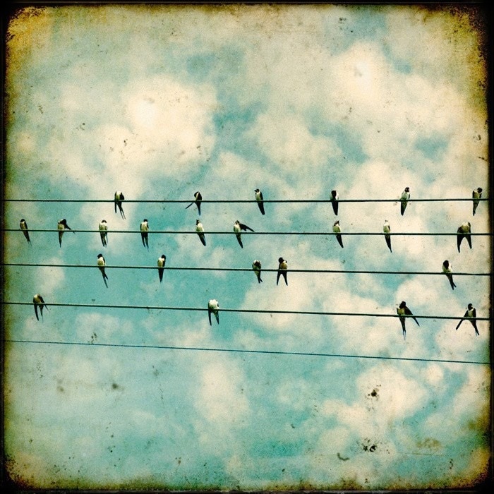
Fine Art Bird Photography- Flock

Stop Being Invisible

Pictures.

Need I say more?

Well, yes. Much more.

Before anyone gets as far as your pictures, they have to first want to click on the thumbnail, because that's the first thing they see. There was a thread on this yesterday, and I wanted to do a show-and-tell.

The web is visual. Shopping on the web is extremely visual. Every day we read threads about low views or no views. It's not because the items are not good or attractive, but rather because nobody clicks them.
Your item's thumbnail is your one and only opportunity to get people into your shop. There's no grey area here. They click or they don't. Full stop.

That thumbnail has to make them want to click. It has to catch their eye, intrigue them, seduce them, make them open the door and walk into your shop. If you had a real store, it would be the display window. I say tag shmag. People mostly browse. Yes, they search too, but they mostly browse sections they're interested in. A page appears. 21 thumbnails, 75x75 in list view or 155x125 in gallery view.

If you're like me, you flick your Magic Mouse or you spin your scroll wheel, and zip down the page, your eyes darting around looking for something to jump out.

So here's an example. A beaded necklace, and two thumbnails out of many possibilities. Both shot with the same really crappy camera, in the same light at the same time.

One view from above, the whole necklace, the photo straight out of the crappy camera.
One close up, just a small section, levels adjusted after the fact.

List view:


Gallery view:


Which would you click? Even though you can't really tell what the 2nd thumbnail is, it stands out.

Here are the two full size pictures:


Notice how the dark photo, though not great, isn't too too bad in full size. It's dark, but that's the only issue. But in a thumbnail, it's just totally unclickable.

So while it's important to have great photos, spend lots of time looking at the thumbnails because they look totally different than the full size pictures. Use high contrast views. Make the colours POP. Make them visually interesting. You have 5 slots for pictures, so the main one doesn't have to show the whole item. Don't just upload you images to Etsy and then see them. Change your images to 75x75 or 155x125 and view them in real size on your screen.
How do they look? Do they jump off the page, or do they just sit there, waiting to be passed by?


Here are the links to the original threads on Etsy:


Stop Being Invisible


Apartment Therapy Set (featured on Apartment Therapy)

Written by guest blogger Bomobob.etsy.com


Saturday, June 26, 2010

Best Etsy Forum Posts: Sales, Facebook and Renewing

A selection of some my favourite etsy forum business posts...

Get the etsy sales you want by TheHouseOfMouse
A huge list of useful links and information on areas for improvement


The ultimate newbie guide by sagittariusgallery
A fantastic resource for newbies!


Fixing the low views on etsy (it's up to you) by TimothyAdam
This one's a bit old but still delivers an important message


Facebook mistakes series by starglowstudio


So you want to be an etsy failure by TwoIndustriousFerret
This one's just funny :)


Some alternatives to renewing by Daneillexo
Other ways to be seen on etsy (by etsy admin Danielle)

Connect with me on facebook

Wednesday, June 2, 2010

Etsy Self-Service Critique: Tips for Improving your Sales

Critique in a can by chunknium

Promoting your etsy store is very important, but if you're not presenting your work effectively, putting a huge amount of effort into promotion probably isn't going to be sufficient to make the sales you're after- you've got to convert those visitors into buyers!

I've provided critiques for quite a number of etsy sellers, both new and not-so-new, and many of the same issues come up each time, so I thought I'd put together this 'self-service' critique guide in case it might help others. If you find the advice helpful, it may even be useful to print the post out and work through the list!
Dendritic Laser-Cut Coaster by Morphologica
One of the most recent additions to my shop

I think it's important even as an established seller to continually refine your photographs and to take a critical look at your work and your shop. I know there are still many things I need to improve (which I should probably be doing instead of writing this post!). Also, I have found that with time I have developed more of an eye for how best to present my work, so I think it can be helpful to view improving your business as an evolving and continual process, rather than something you'll get 100% right immediately.


Self-Service Critique

Garden Friends Banner by LittleMoAndFriends

Shop Banner and Avatar
Your shop banner is important for providing buyers with a strong first impression and creating an overall ‘brand’. The most common problems I notice with banners:
  • blurry image
  • pixelated text/pictures that don’t look very professional
  • they don’t reflect the products/image of the shop
Take a critical look at your banner- does it suffer from any of these problems?

Your avatar is also important, especially in the etsy forums (as well as storque comments and convos). It can be a good idea to make your avatar something that people are very likely to click on- perhaps your most popular item. The main thing here is to ensure that your avatar is crisp rather than blurry, and that it is clear what the picture is.


Greeting Card Bunny Speaks by PocketCarnvial

Shop Title and Shop Announcement
These areas are important for being found in google searches- try to include important keywords in both (your shop title is the bold title underneath your banner). Shop announcement length is something that people have different opinions about. Personally, I like to have a short announcement so that people don’t have to scroll down all the time to see my pictures, and so that I get the most important information (including a feel for the concept behind my designs) across without overwhelming buyers.

Other shops like to include a lot of information, and that can work too. My advice would be to make sure you keep it relevant and perhaps include some of the less important information in your profile and policies rather than in your announcement. Regardless of which option you decide on, it can help to take a careful look at your announcement and see whether it reflects the kind of image/brand you’re trying to present, and whether it contains important keywords that will help people find your shop in search.


Bad Kitty Ring- Silver- by WhiteMetal

Photos
This is the number one problem area I come across when helping sellers out with critiques. Great photos are absolutely critical in terms of converting visits to sales, as well as in terms of being featured on blogs, in the press, and in treasuries or etsy’s front page. If your photos aren’t very good, putting a lot of time into promotion probably isn’t going to be very effective.
Take a critical look at your photos and ask yourself these questions:
  • Are your photos crisp or blurry/unclear? Are they bright enough without being overexposed?
  • When appearing in treasuries and on the front page, items appear in gallery mode. Are your items cut off/do they look good in gallery mode? Items being cut off in pictures is a very common issue.
  • Are your backgrounds too busy? Is the focus on the item, or does the background interfere? Do all your backgrounds follow a consistent theme throughout your shop, creating a coherent look, or do they seem like a random collection of different things (earrings on glasses, tissue paper, wrapping paper etc)? If using a white background, is it bright and white enough? Plain backgrounds can sometimes help make your items look more professional (depending on the nature of your items). When choosing a background, also think about whether it would be easy to match your picture with other items in treasuries/front page collections.
  • Think about the angles of your items. Does it look as though your items have been cleverly and professionally arranged, or are there earrings at weird angles that are not very appealing?
Eight Ceramic Nesting Lotus Bowls by WhitneySmith
  • Are your photos good enough to be on etsy’s front page? Whenever I am creating a new listing, I try to think about my photos in this way. A good tip is to try putting together a treasury in postersketch and adding your own item to see how it compares to other items that you think have outstanding photographs. Keep in mind that pictures with logos or watermarks are often not chosen for treasuries or the front page.
  • Do your photos show enough detail of your item? If you have an artistic photo of part of your item for the first picture, you may want to add additional pictures to give the buyer information about the piece to encourage purchase.
You can find lots of useful photography tips on Etsy's blog


Berry Nice Handmade Cold Process Soap by InnerEarthSoaps

Item Descriptions
It’s good to write descriptions that provide the buyer with all the information they need (size, materials etc), but that also give a bit of personality to the listing in terms of the concept behind the piece/the making process etc. This is often an important part of buying handmade/independent design. InnerEarthSoaps always writes descriptions that make me want to buy something!
While looking at your current descriptions, keep these questions in mind:
  • Have you provided measurements? Both inches and cm can be helpful for international buyers. If selling clothing etc, make sure you provide all of the necessary measurements.
  • Have you given information about the materials used?
  • Have you conveyed information about the story or concept behind the piece, perhaps suggested uses/occasions for the item, and/or mentioned anything about the creation process?
  • Try not to include too much unnecessary information in your descriptions. For example, if you want to share all of your facebook, twitter links etc, these could perhaps go in your profile instead.
Some helpful links about writing item descriptions:
http://www.etsy.com/storque/how-to/seller-how-to-5-tips-for-item-descriptions-6017
http://www.etsy.com/storque/section/howTos/article/making-the-most-of-your-descriptions/635/


Tropical Tags x6- Recycled Card - by koot

Tagging
Effective tagging is absolutely critical- if you don’t use your tags it will be very hard for people to find you. Every additional tag gives you another chance to be found in search! The google keywords tool can be very helpful for thinking of search terms related to your item, and provides an idea of search frequency for different terms. The best advice I’ve read on tagging is on TheHouseOfMouse's blog


Raven from MolecularMuse

Profile, policies and shipping
Your bio provides you with an opportunity to tell buyers a bit about the person behind the shop, which adds personality to your work. You can also explain the concepts behind your designs, and give information about the making process. It’s a bit discouraging for buyers if they visit your profile and find it blank. I would avoid adding too much information here (eg a list of every blog you’ve ever been featured on)- you don’t want to overwhelm anyone. Raven from molecularmuse has done a great job.

Policies are very important in giving the buyer a sense of security- if there is no information given in the policies section it can put people off purchasing. Try to write in a positive tone, and think carefully about any comments suggesting that you will not be responsible for packages that are lost. Firstly, this may discourage people from buying. Secondly, PayPal does actually hold the seller responsible for making sure that packages are delivered to the buyer. Perhaps look around at the policies of some successful sellers if you are unsure. This should give you some ideas (but don’t copy of course).

A note about shipping- it can be a very good idea to include international shipping as an option, as quite a number of buyers are not based in the US. If buyers have to convo you to get a price because you don’t have that option listed, they will often move on and purchase somewhere else (I know because I’m an international buyer and I do that all the time).


Earrings Blue Sapphire, Wire Wrapped Briolettes

Feedback and number of listings
Finally, two other common problems that I often see relate to lack of feedback and a low number of listings. If you have no feedback, it’s often a good idea to purchase a few things in order to get some feedback so that buyers have a bit more confidence when purchasing.
When starting out and before getting many sales, some people are reluctant to list many items. However, having a lot of items can make it a lot more likely that you will be found in searches, and can provide the buyer with more choice. Also, having only a few items can sometimes give the impression that you’re not really a very active shop. Listing 50 items only costs $10, so it’s worth giving it a proper shot.


Custom Logo Cupcakes by shortbreadnyc

Promotion
As well as making sure your shop presents the best image possible, it’s also really important to promote off-etsy in order to bring buyers in. It’s hard to be seen as a new shop on etsy (unless you’re really lucky), and I’ve found promotion absolutely critical to making my shop successful.
If you’re just getting started, I’d recommend setting up a facebook fan page, twitter account and perhaps a blog. I won't cover promotion in detail in this blog post, but advice on promotion is one of the main focuses of this blog, so stay tuned for more information about that aspect of etsy selling.
Additional links to help with promotion:
My previous post on how to get twitter followers
Information from Timothy Adam about facebook and blogging


Silver Sheriff Star Metal Button from VoodooRabbit

Further help with critiques:
  • Live critiques are often run in the etsy labs (by admin or the Sellers Assisting Sellers team)
  • You can contact someone from the Sellers Assisting Sellers mentor list
  • It can be helpful to post in the critique section of the etsy forums
  • Your etsy team may have a critique section, or you could perhaps starts a thread asking for help

A note about asking for critiques
If you are approaching someone for a one-on-one critique, please consider the amount of time involved in helping you (sometimes more than an hour). I would really suggest only asking someone for a critique if you are truly willing to implement changes (obviously you don’t have to accept suggestions if you don’t agree with them, but many people ask for a critique when they’re not actually willing to put the work in to make any changes). A reply to thank the person helping you is always a nice thing to do too :)

. . .

Gemstone Necklace Water Drop by poetryjewelry

If you use this information to make changes in your shop, please feel free to post links to ‘before’ and ‘after’ photos in the comments, or comments on success you have after implementing some of these tips- I’ll try to feature them in a future blog post!

I’ll leave you with some inspiring comments from PoetryJewelry, who I helped when she was feeling a bit hopeless about getting started making sales. Hopefully it will encourage any readers who are feeling a bit invisible!

The improvements have been phenomenal. It's less than two months since I made the changes and started a fanpage and twitter, I now have almost 300 followers on twitter and nearly 300 on my fanpage. The views have shot up by more than 100%. My google analytics show that I have daily traffic of an average of 65 people (I had no views 2 mnths back for days on end), my bounce rate has dropped and unique visitors have shot up. It's like 250% more than what I had. After the changes, thanks to Morphologica, I have been on 4 treasuries, on Etsy's front page, got featured on blogs and, more than any of this, had 21 sales. I feel like it's a new start and am so positive about my store and work now. - PoetryJewelry


laser cut jewelry
Connect with me on facebook
Related Posts with Thumbnails